simplifying the foundational feedback flow for a UX to enjoy
simplifying the foundational feedback flow for a UX to enjoy
simplifying the foundational feedback flow for a UX to enjoy
Freeletics · iOS/Android · jul 2022-aug 2022
Freeletics · iOS/Android · jul 2022-aug 2022
Freeletics · iOS/Android · jul 2022-aug 2022
USER RESEARCH · data · prototyping · ai & flow · usability · design strategy · ui · mentoring
USER RESEARCH · data · prototyping · ai & flow · usability · design strategy · ui · mentoring
USER RESEARCH · data · prototyping · ai & flow · usability · design strategy · ui · mentoring
context
Giving feedback on their workout is essential for athletes because it helps the algorithm provide truly personalized training as well as challenging the athlete just enough to improve performance over time.
For years we heard from users that there were just too many screens & taps to go through during a training session. Users wanted to focus more on training itself and feel less interrupted, yet we never changed the training flow. In 2022, we decided it was time to create an intuitive & simplified key flow to provide a state-of-the-art UX and an intuitive and modern UI.
role
key designer and mentor
Throughout this project, I was the key designer, leading the entire design process from user research to delivery. I led the UX strategy and the vision for this product area alongside my product and engineering counterparts.
As the project started, a new junior content designer and a new junior researcher joined the team; I mentored them throughout the project by giving them feedback and offering guidance. I also communicated design decisions to stakeholders, product leads, and the executive team.
process
We analyzed the full training flow to get a better understanding of the user problems, technical constraints, and to identify opportunities.
We analyzed the full training flow to get a better understanding of the user problems, technical constraints, and to identify opportunities.
We analyzed the full training flow to get a better understanding of the user problems, technical constraints, and to identify opportunities.
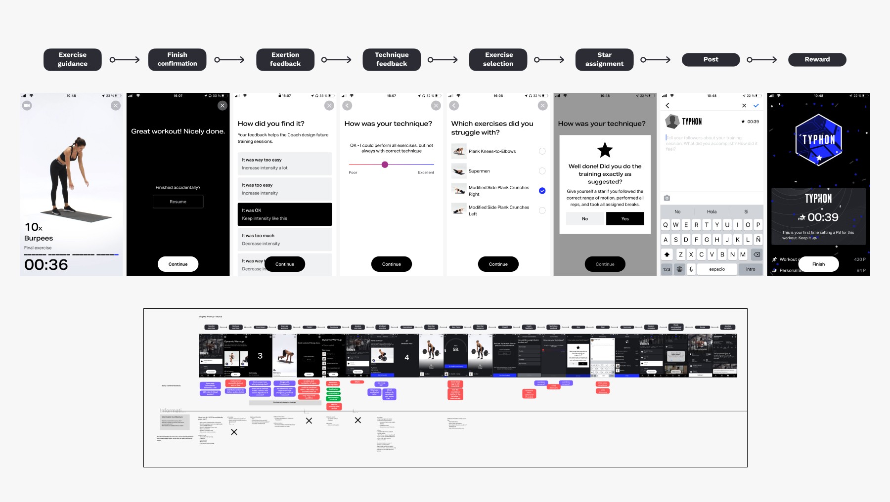
Top: old feedback flow. Bottom: part of the full training flow analysis.
HMW help users experience less friction while providing feedback? (interactions, clarity, necessity, time, cognitive load)
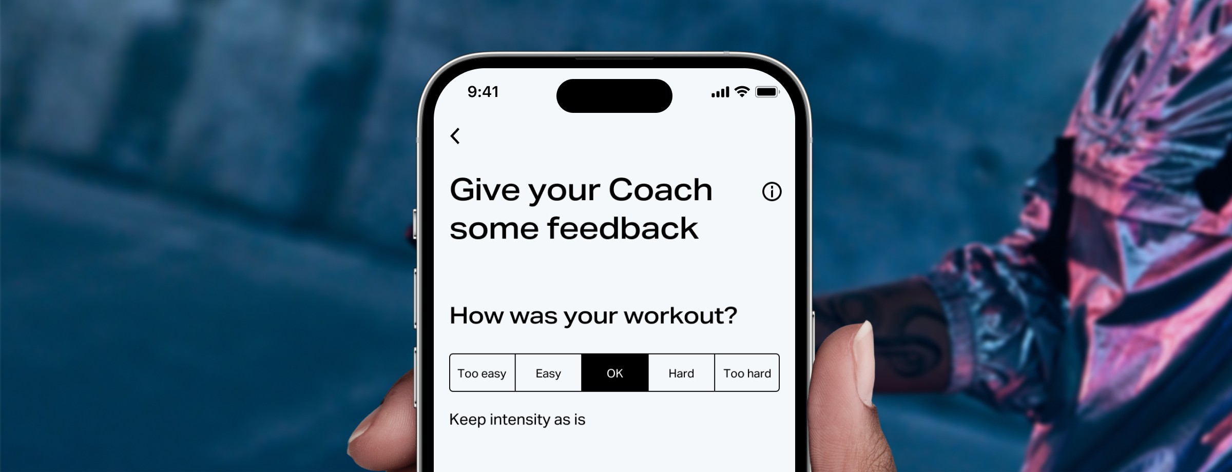
The athlete’s feedback to the coach algorithm is divided into two types: Exertion feedback and technique feedback. Once the feedback has been given, users were presented with follow-up questions and screens. Looking at quantitative data on users' behavior, we saw that exertion feedback shares ~80% of “OK” & technique feedback shares ~56% of "Excellent". Based on this data, I created the concept of default selections. I set the most common use cases, the happy path, as the default selection so the user only needs to interact with the confirmation button.
I also explored how to combine the multiple feedback screens into one screen only. The biggest challenge I faced in this phase was to reduce cognitive load while adding several pieces of information to one screen.
HMW help users experience less friction while providing feedback? (interactions, clarity, necessity, time, cognitive load)
The athlete’s feedback to the coach algorithm is divided into two types: Exertion feedback and technique feedback. Once the feedback has been given, users were presented with follow-up questions and screens. Looking at quantitative data on users' behavior, we saw that exertion feedback shares ~80% of “OK” & technique feedback shares ~56% of "Excellent". Based on this data, I created the concept of default selections. I set the most common use cases, the happy path, as the default selection so the user only needs to interact with the confirmation button.
I also explored how to combine the multiple feedback screens into one screen only. The biggest challenge I faced in this phase was to reduce cognitive load while adding several pieces of information to one screen.
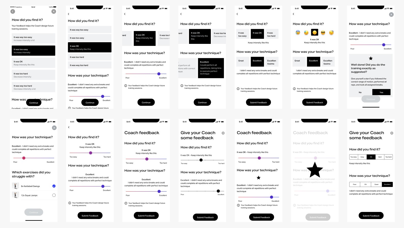
Exploring UI solution variants.
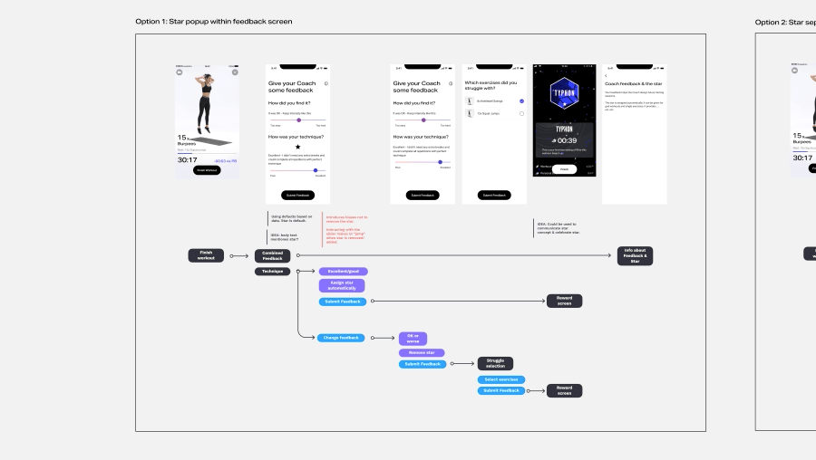
I designed 5 proposals for the flow & UI and shared them with my engineering colleagues. After multiple refinement discussions and due to technical constraints, I decided to add a “finish” button to eliminate a full legacy screen and remove the possibility of users accidentally finishing their workout. Ultimately I chose one concept for the following reasons:
Fastest implementation with the least effort
The happy path enables only one screen for feedback
It does not bias users in giving themselves a star or removing it
Exploring alternative flow variants.
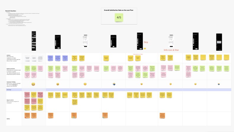
To validate our concepts and usability, I built a prototype, which we tested with new and current users. The most interesting insights were:
Users were positive about providing feedback with one screen only
It was still not entirely clear to new users what feedback is and how it works
Neutral opinion about the slider, since the options available, were not transparent
Neutral feedback for the “finish” button

The first Figma prototype with a full immersive flow concept, including feedback flow.
Value & usability research and analysis.
iterate, iterate, and iterate
Based on the above findings, we refined the flow. We decided to extensively educate first-time users on feedback, stars, and why giving feedback is important. I was not satisfied with the legacy sliders due to their usability flaws, so I explored how to improve them but quickly realized it was just the wrong UI element for the job because it lacked clarity and confused the users.
Based on the above findings, we refined the flow. We decided to extensively educate first-time users on feedback, stars, and why giving feedback is important. I was not satisfied with the legacy sliders due to their usability flaws, so I explored how to improve them but quickly realized it was just the wrong UI element for the job because it lacked clarity and confused the users.
Based on the above findings, we refined the flow. We decided to extensively educate first-time users on feedback, stars, and why giving feedback is important. I was not satisfied with the legacy sliders due to their usability flaws, so I explored how to improve them but quickly realized it was just the wrong UI element for the job because it lacked clarity and confused the users.
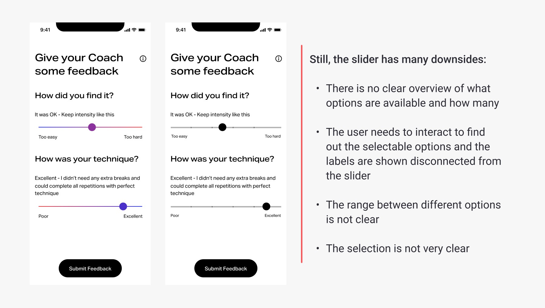
Slider exploration & usability issues.
My solution was to introduce segmented buttons. The only question remaining was how and if this solution would work when localized. So I tested it in French, Russian, and Spanish and as it worked in different languages, we moved forward with it.
Unfortunately, after shipping the new Feedback UX, our planned survey got deprioritized. But this was not our only problem! With big surprise, we got quite some negative feedback in the Freeletics forum regarding a small UI element: the “finish” button. Our first reaction was to hold on and wait as this button didn’t break anything and the users could have been biased by the old UX. Furthermore, due to technical limitations, we had good reasoning for introducing this button.
We decided to do a forum survey and another set of interviews to dig deeper, almost half the users said that they had problems hitting the button. The main insights were:
The button is hard to hit when you are at the end of a workout, perhaps without glasses and out of energy
You need to reach your phone to tap the button and potentially lose seconds when trying to set a new personal best during a time-sensitive workout.
Two different interactions within a workout, are not consistent.
After a team refinement, I decided on implementing one simple solution that required more engineering effort but left the users happy: to remove the “finish” button and add a “back” button on the following screen to cater to the use case of accidentally finishing the workout.
My solution was to introduce segmented buttons. The only question remaining was how and if this solution would work when localized. So I tested it in French, Russian, and Spanish and as it worked in different languages, we moved forward with it.
Unfortunately, after shipping the new Feedback UX, our planned survey got deprioritized. But this was not our only problem! With big surprise, we got quite some negative feedback in the Freeletics forum regarding a small UI element: the “finish” button. Our first reaction was to hold on and wait as this button didn’t break anything and the users could have been biased by the old UX. Furthermore, due to technical limitations, we had good reasoning for introducing this button.
We decided to do a forum survey and another set of interviews to dig deeper, almost half the users said that they had problems hitting the button. The main insights were:
The button is hard to hit when you are at the end of a workout, perhaps without glasses and out of energy
You need to reach your phone to tap the button and potentially lose seconds when trying to set a new personal best during a time-sensitive workout.
Two different interactions within a workout, are not consistent.
solution
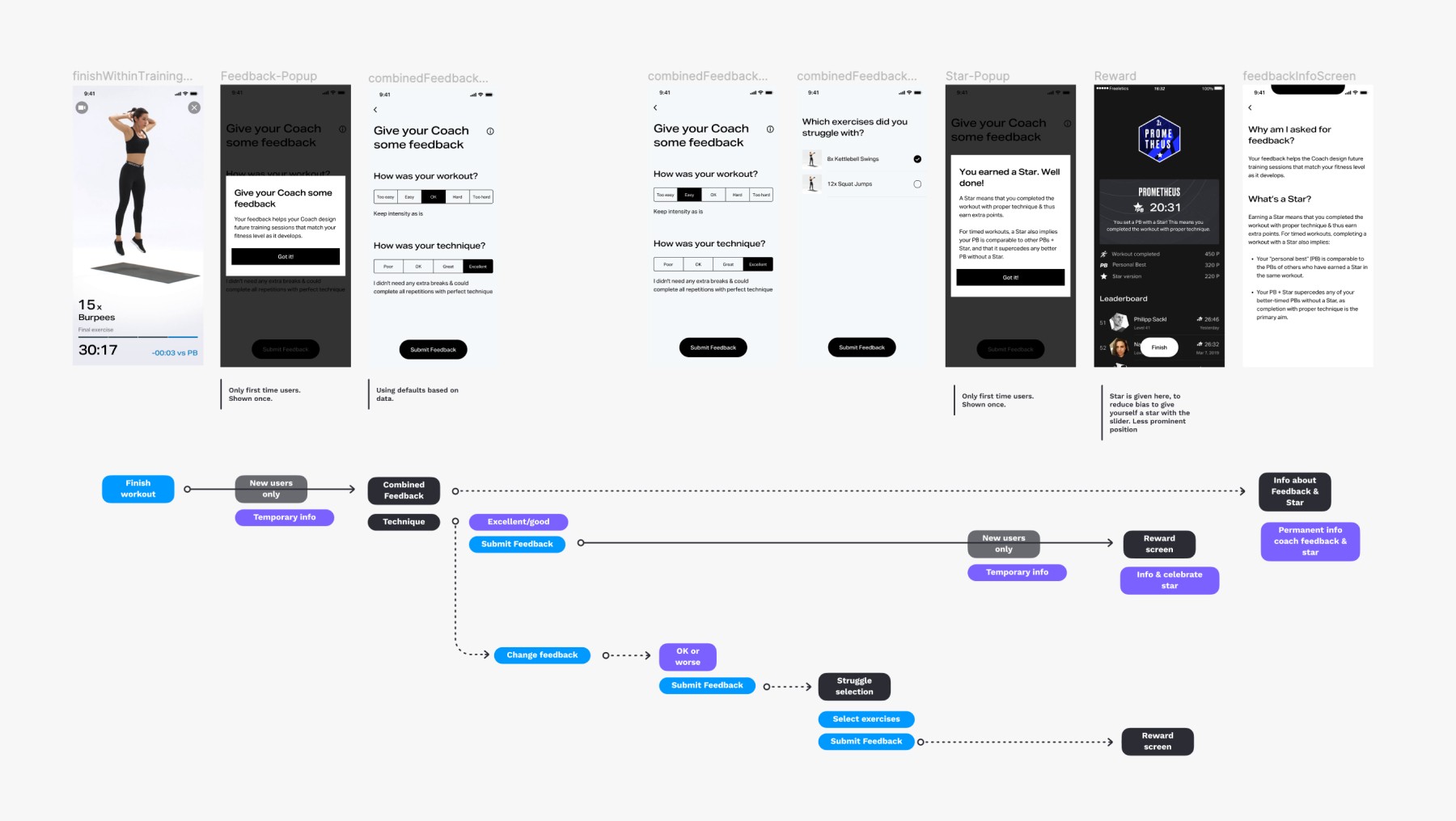
Complete final flow, covering all potential use cases. Happy path: 1 interaction to provide feedback.
impact
Before our improvements, users had to go through 6+ screens and 10+ interactions per workout.
Now, users only have to go through 2 or 3 post-workout feedback screens and only perform 2 interactions at best. This is an especially great improvement, considering users average 4 workouts per session.
Before our improvements, users had to go through 6+ screens and 10+ interactions per workout.
Now, users only have to go through 2 or 3 post-workout feedback screens and only perform 2 interactions at best. This is an especially great improvement, considering users average 4 workouts per session.
To assess the complete skill progression feature, an A/B test was deemed impractical due to the length of time it would take. Instead, a phased rollout was chosen as it allowed us to gather some initial data and validate the release. The findings revealed that there was very high adoption among athletes who accessed the feature via the Coach settings.
For the celebration with rewards, we conducted an A/B test that resulted in a 4.8% increase in training retention (2 training tasks completed in 7 days). Those specific training-related moments motivated users to train with the Coach more consistently and frequently. We still wonder if it was all because users were so in love with the confetti! ;)
“I find it also great, especially the summary "too easy/too hard" and "good/bad" incl. the automatic star assignment. I like it very much!” — Freddy, Freeletics forum
“I find it also great, especially the summary "too easy/too hard" and "good/bad" incl. the automatic star assignment. I like it very much!” — Freddy, Freeletics forum
“I find it also great, especially the summary "too easy/too hard" and "good/bad" incl. the automatic star assignment. I like it very much!” — Freddy, Freeletics forum
“The general change with the buttons instead of the slider is super, …” — Tonzn, Freeletics forum
“The general change with the buttons instead of the slider is super, …” — Tonzn, Freeletics forum
“The general change with the buttons instead of the slider is super, …” — Tonzn, Freeletics forum
After the button change:
After the button change:
After the button change:
“Many thanks for this great news! That is the best news of the year ☺️🕺🥳 I appreciate that. It makes me really happy.” — Smudobub, Freeletics forum.
“Many thanks for this great news! That is the best news of the year ☺️🕺🥳 I appreciate that. It makes me really happy.” — Smudobub, Freeletics forum.
“Many thanks for this great news! That is the best news of the year ☺️🕺🥳 I appreciate that. It makes me really happy.” — Smudobub, Freeletics forum.
Lesson Learned
It is literally impossible to prove that a new idea will work before actually trying it. But that doesn’t mean we should blindly leap into the future hoping that our ideas will work out. The process of testing can both improve the quality of the UX and help us gain the confidence to build it. In the example of the “finish” button, in a constructed testing environment, things went fine. Once the solution was shipped to our users, and they used it in their fitness environment, actually doing burpees – it failed. We could have designed a better test, but it would still not have given us the results we saw after real-life usage. You have to ship it to prove it.
It is literally impossible to prove that a new idea will work before actually trying it. But that doesn’t mean we should blindly leap into the future hoping that our ideas will work out. The process of testing can both improve the quality of the UX and help us gain the confidence to build it. In the example of the “finish” button, in a constructed testing environment, things went fine. Once the solution was shipped to our users, and they used it in their fitness environment, actually doing burpees – it failed. We could have designed a better test, but it would still not have given us the results we saw after real-life usage. You have to ship it to prove it.
It is literally impossible to prove that a new idea will work before actually trying it. But that doesn’t mean we should blindly leap into the future hoping that our ideas will work out. The process of testing can both improve the quality of the UX and help us gain the confidence to build it. In the example of the “finish” button, in a constructed testing environment, things went fine. Once the solution was shipped to our users, and they used it in their fitness environment, actually doing burpees – it failed. We could have designed a better test, but it would still not have given us the results we saw after real-life usage. You have to ship it to prove it.